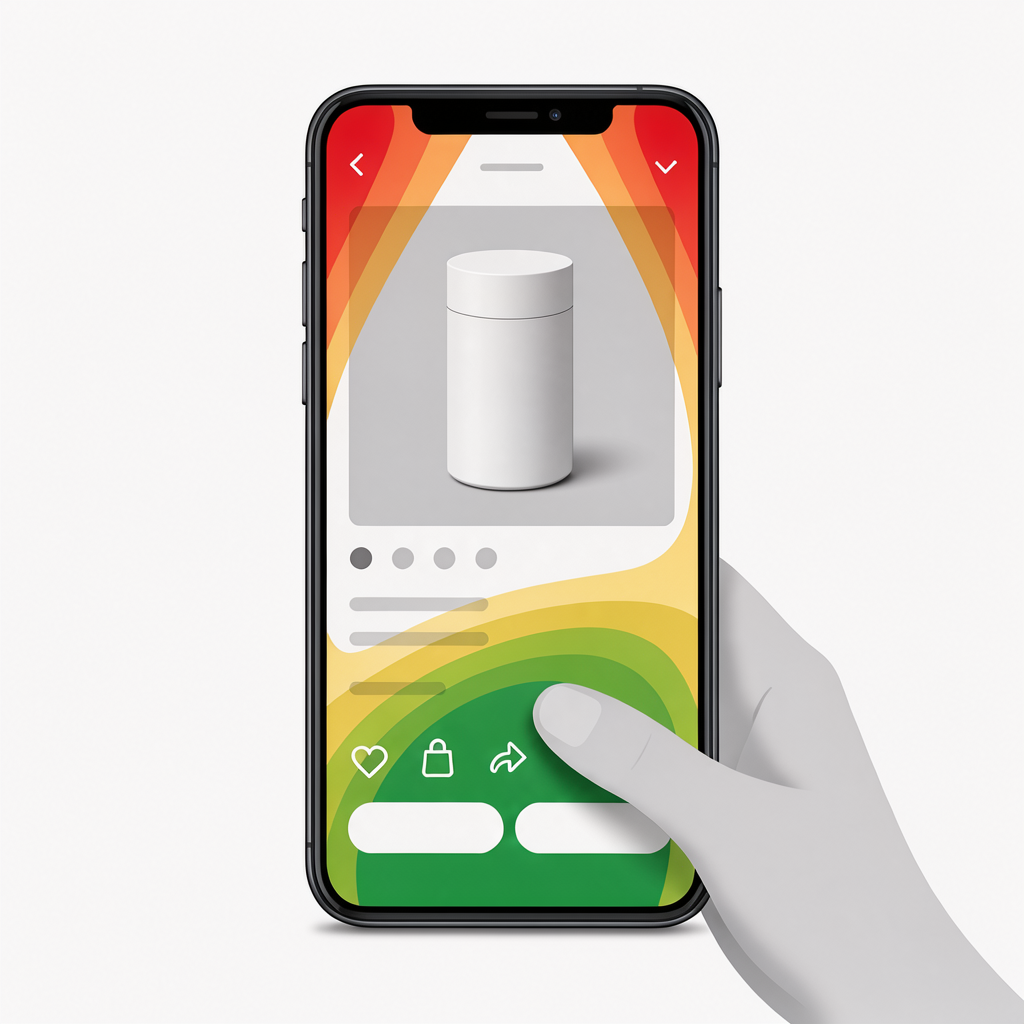
- Button placement in the thumb-friendly zone (bottom-third of mobile screens) increases tap rates by 15-23% compared to mid-screen positioning
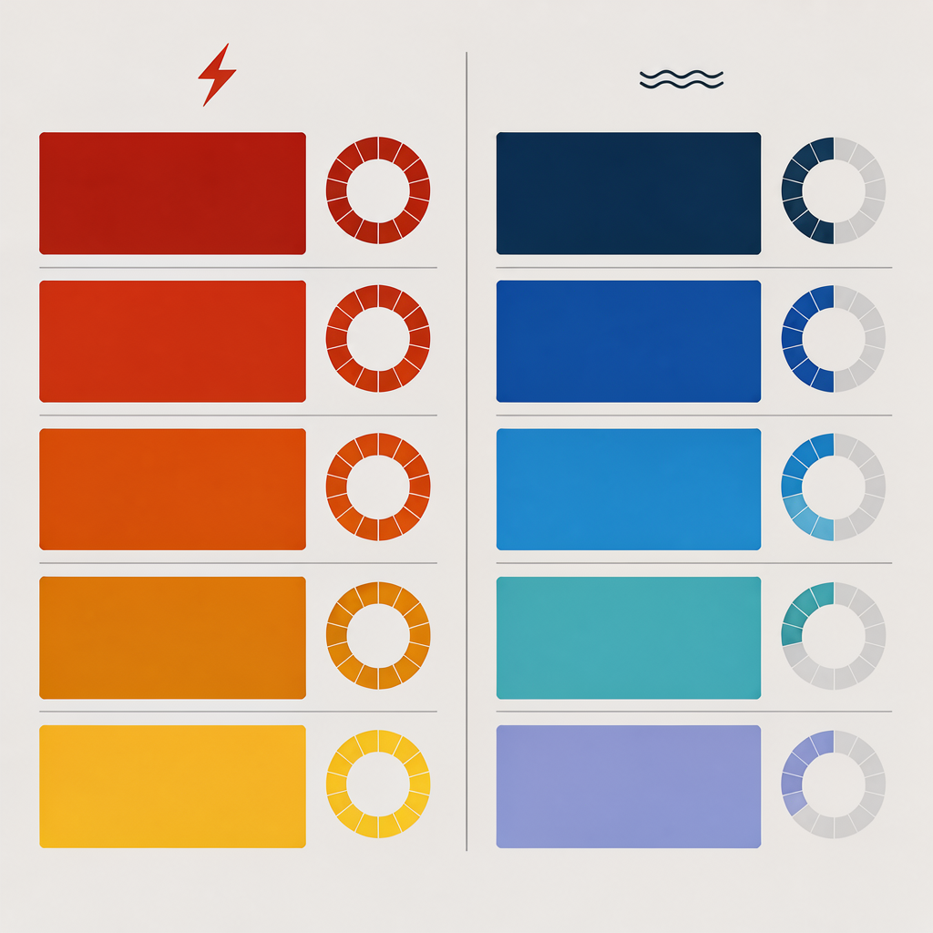
- Orange and red CTA buttons outperform green and blue on TikTok Shop by triggering urgency-based purchasing behavior aligned with the platform's fast-paced content consumption
- Action-verb CTAs like “Get Yours Now” or “Grab It” convert 18% higher than passive phrases like “Add to Cart” or “Buy”
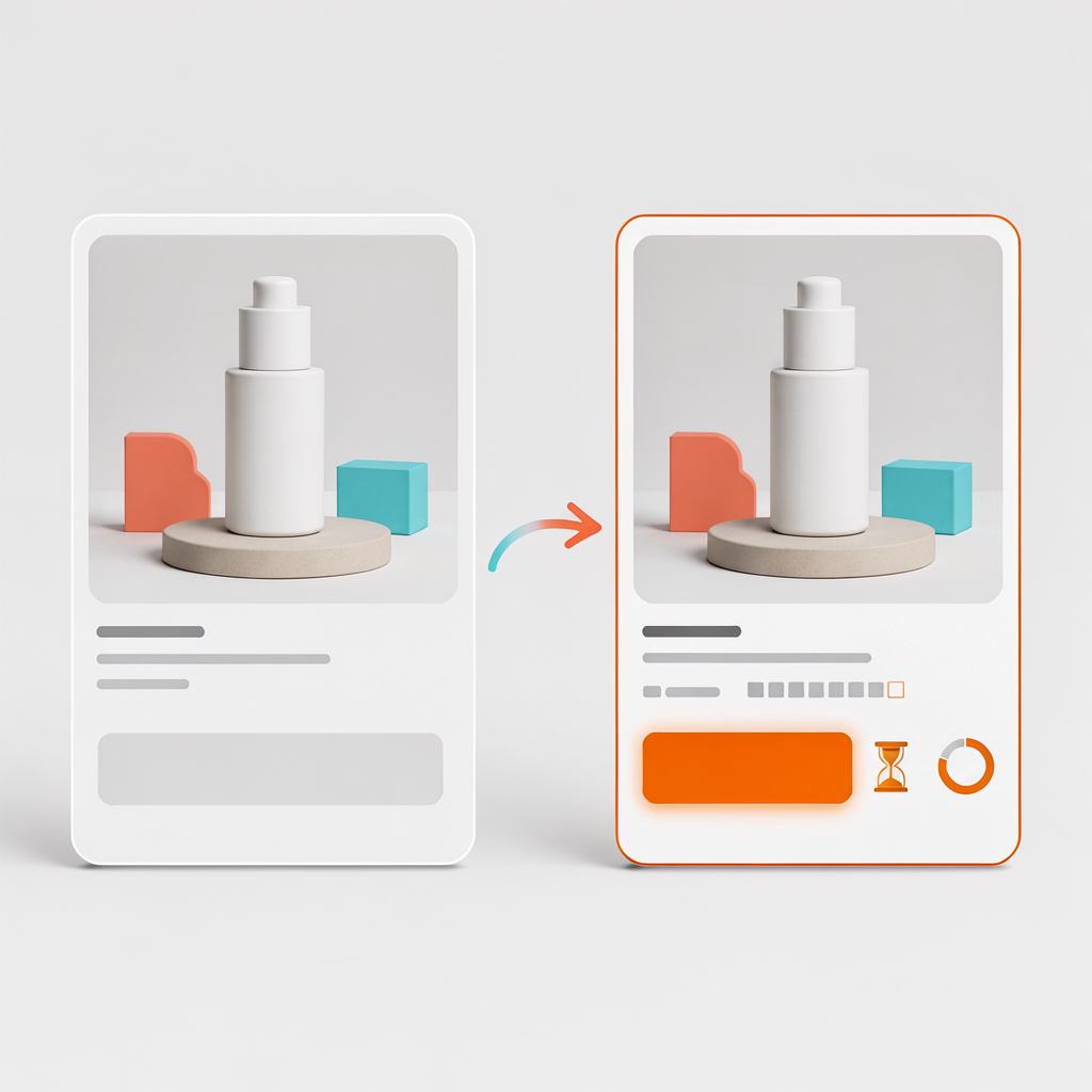
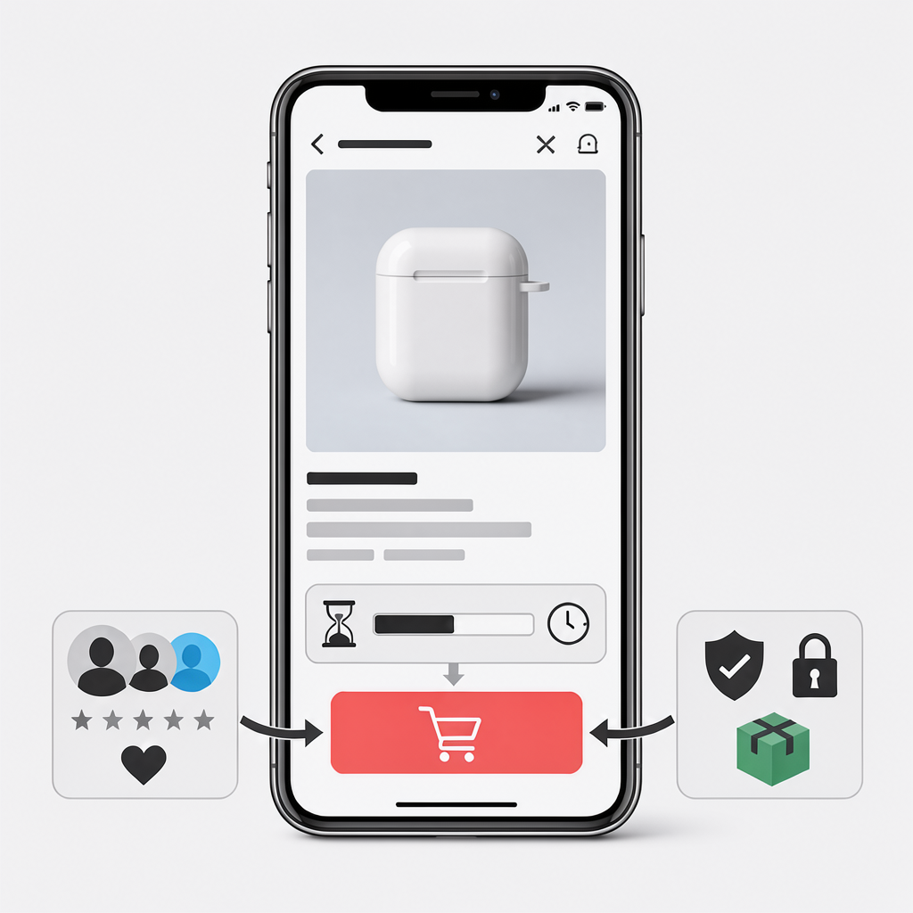
- Scarcity indicators placed within 50 pixels of the add-to-cart button amplify conversion through loss aversion psychology
- Social proof counters showing real-time purchases create FOMO that compresses the decision timeline from minutes to seconds
The difference between a TikTok Shop listing that converts and one that stalls often comes down to milliseconds of psychological decision-making. Unlike traditional ecommerce where shoppers arrive with intent, TikTok Shop compresses the entire customer journey into discovery-led buying—meaning your add-to-cart button optimization psychology must work within a fundamentally different architecture.
Your product page has roughly 3-7 seconds to convert a scroller into a buyer. Every pixel matters.
💡 Dropified Insight: Dropified's one-click product import automatically pulls optimized product descriptions and images from suppliers, but the real conversion magic happens when you customize your TikTok Shop listings with psychology-driven CTA elements. Use Dropified's bulk editing tools to A/B test button copy across your entire catalog simultaneously—something that would take hours manually.
Why TikTok Shop Button Psychology Differs From Traditional Ecommerce
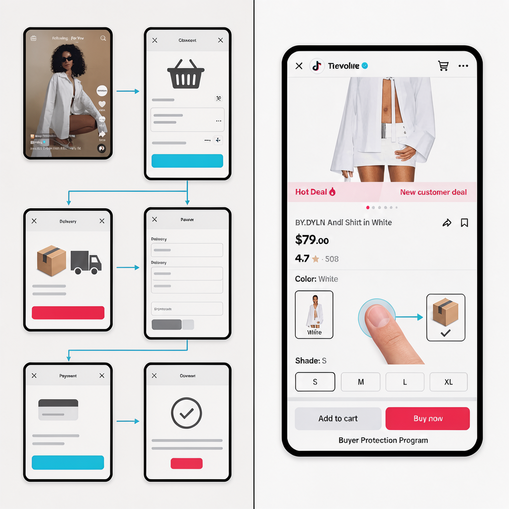
Traditional ecommerce operates on intent-based purchasing. Someone searches, compares, reads reviews, and eventually decides. The add-to-cart button serves as a commitment checkpoint in a longer journey.
TikTok Shop flips this model entirely.
Shoppers discover products through creator content, watch demonstrations in context, and face an immediate purchase decision—all without leaving the app. This compressed funnel means your add-to-cart button isn't competing against other products. It's competing against the next swipe.
The psychology shifts from “convince them to choose you” to “capture the impulse before it fades.”
Research from conversion optimization studies shows that behavioral patterns on TikTok include scroll velocity, time-of-day purchasing habits, and engagement patterns that differ dramatically from desktop shopping behavior. Your button optimization must account for these mobile-first, impulse-driven interactions.
The Thumb Zone Principle
Mobile users hold their phones with their thumbs doing most of the work. The “thumb zone”—the bottom third of the screen—represents the easiest area to tap without repositioning grip.
TikTok Shop listings that position their primary CTA within this zone see measurably higher engagement. When users must stretch or adjust their grip to tap “Add to Cart,” friction increases and conversions drop.
Color Psychology That Drives TikTok Shop Conversions
Color choice isn't aesthetic preference—it's conversion strategy. On TikTok Shop specifically, certain colors trigger faster purchasing decisions because they align with the platform's energetic, urgent content environment.
High-converting colors for TikTok Shop CTAs:
- Orange: Creates urgency without aggression, stands out against TikTok's dark interface
- Red: Triggers excitement and impulse behavior, works especially well during live shopping events
- Coral/Salmon: Softer urgency that performs well for beauty and lifestyle products
Lower-performing colors:
- Green: Associated with “proceed” but lacks urgency on fast-paced platforms
- Blue: Conveys trust but slows decision-making—opposite of what impulse buying requires
- Gray: Neutral tones disappear against content and reduce tap motivation
The key insight: TikTok's algorithm optimizes for users with behavioral patterns matching existing converters, including those who respond to urgency cues. When your visual elements align with impulse-buyer psychology, you're essentially pre-qualifying your audience for the algorithm.
If you're setting up your first TikTok live shopping event, color consistency between your stream overlays and product page CTAs creates visual continuity that reduces cognitive load during purchase decisions.
CTA Copy Patterns That Outperform Generic Buttons
The words on your button matter more than most sellers realize. Generic “Add to Cart” copy treats TikTok Shop like Amazon—a fundamental misunderstanding of the platform's psychology.
Action Verbs That Convert
Replace passive language with commands that match TikTok's energy:
| Instead of… | Use… | Why it works |
|---|---|---|
| Add to Cart | Grab Yours | Implies scarcity, ownership |
| Buy Now | Get It Now | Action-oriented, immediate |
| Purchase | Claim This Deal | Creates exclusivity |
| Shop | Snag It | Casual, matches platform tone |
Urgency Amplifiers
Pair your CTA with contextual urgency:
- “Only 12 left—Get Yours”
- “Selling fast—Grab It”
- “Live deal ends soon”
These patterns leverage the psychology triggers behind TikTok Shop purchases, particularly loss aversion and social proof mechanisms that drive checkout behavior.
💡 Dropified Insight: When importing products through Dropified, you can customize product titles and descriptions before pushing to TikTok Shop. Use this to embed urgency language directly into your listings. Dropified's product customization features let you create variations for split-testing different CTA approaches across your inventory.
The Proximity Principle: What Surrounds Your Button Matters
Button optimization isn't just about the button itself. Elements within 50-100 pixels of your CTA significantly impact conversion rates.
High-Impact Proximity Elements
Social proof counters: “1,247 sold in the last hour” positioned directly above or beside the CTA creates FOMO that compresses decision timelines.
Scarcity indicators: Stock counters or “limited quantity” badges within visual range of the button trigger loss aversion.
Trust badges: Shipping guarantees, return policies, or verification checkmarks reduce purchase anxiety.
Price anchoring: Showing original price crossed out with sale price near the CTA reinforces value perception.
What to Remove From Button Proximity
- Competing links or navigation elements
- Dense text blocks requiring reading
- Multiple color accents that dilute focus
- Unrelated product recommendations
The goal is singular focus. When a user's eyes land on your product, every visual element should funnel attention toward one action: tapping that button.
For sellers using AI video agents for 24/7 TikTok live streams, ensure your automated content consistently references the same CTA language that appears on your product pages. Consistency between video content and listing copy reduces cognitive friction during the transition from watching to buying.
Testing Framework: Measure What Actually Moves Cart Rates
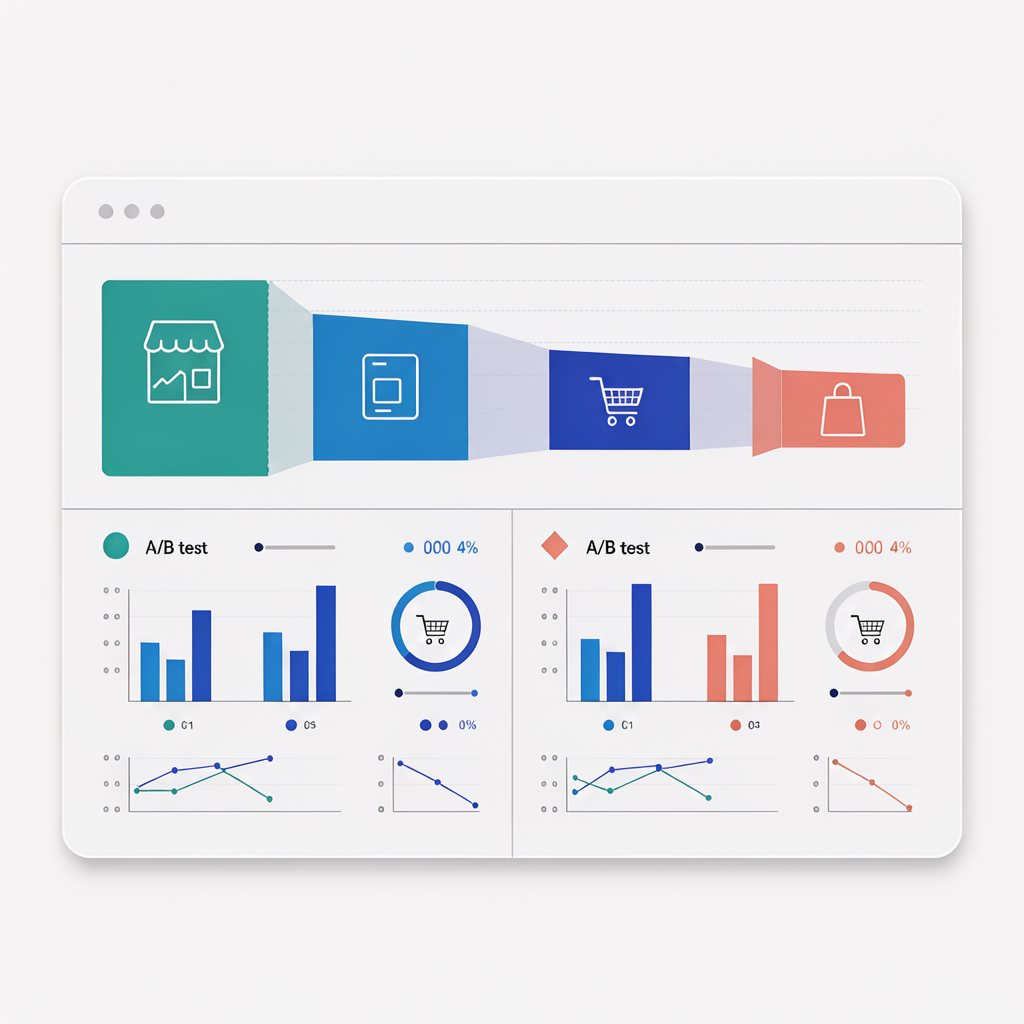
Optimization without measurement is just decoration. Implement systematic testing to identify what works for your specific products and audience.
The 72-Hour Split Test Protocol
- Baseline measurement: Track your current add-to-cart rate for 72 hours minimum
- Single variable change: Modify only one element (color, copy, or placement)
- Equal traffic allocation: Ensure both variants receive comparable exposure
- Statistical significance: Don't declare winners until you have 100+ conversions per variant
Key Metrics Beyond Add-to-Cart Rate
- Cart-to-purchase ratio: High add-to-cart but low purchase suggests checkout friction
- Time-to-cart: Faster decisions indicate effective urgency triggers
- Return visitor cart rate: Measures whether your optimization builds purchase intent over time
If you're finding viral products using the TikTok burner method, apply these testing protocols to new product launches immediately. Early optimization data compounds over time as TikTok's algorithm learns which of your listings convert.
Common Mistakes That Tank TikTok Shop Conversions
Avoid these optimization killers:
Copying Amazon conventions: TikTok Shop isn't a search-and-compare platform. Borrowing UX patterns from intent-based marketplaces ignores the discovery-led psychology driving purchases here.
Ignoring mobile-first design: If you're designing or reviewing listings on desktop, you're missing how 95%+ of your buyers will experience them.
Over-cluttering product pages: More information doesn't equal more conversions. Clarity and focus outperform comprehensive detail on impulse-driven platforms.
Static optimization: Consumer behavior evolves. Seasonal trends, platform updates, and competitive dynamics require ongoing testing—not set-and-forget approaches.
Sellers focused on TikTok Shop compliance and suspension recovery should note that aggressive urgency tactics (fake scarcity, misleading countdown timers) can trigger policy violations. Authentic urgency converts better and keeps your account in good standing.
Putting Psychology Into Practice: Your 7-Day Optimization Sprint
Days 1-2: Audit current listings. Screenshot every product page and evaluate button placement, color, copy, and proximity elements against the principles above.
Days 3-4: Prioritize changes. Focus on your top 20% revenue-generating products first.
Days 5-6: Implement and launch tests. Use Dropified's bulk editing capabilities to push changes efficiently.
Day 7: Review initial data and plan iteration cycles.
For sellers bypassing the 0 views jail with AI-generated scripts, coordinate your content strategy with your listing optimization. When your videos gain traction, optimized product pages capture that momentum more effectively.
Start Converting More Browsers Into Buyers
TikTok Shop add-to-cart button optimization psychology isn't about tricks—it's about understanding how discovery-led purchasing differs from intent-based shopping and designing your listings accordingly.
The 23% cart rate increase isn't theoretical. It's achievable when you systematically apply thumb-zone placement, urgency-driven color psychology, action-oriented CTA copy, and strategic proximity elements.
Ready to optimize your entire TikTok Shop catalog? Start your free Dropified trial and use bulk editing tools to implement these conversion principles across all your listings in a single afternoon. Your add-to-cart rates will thank you.
✨ Want an AI Summary of this article?